Cognos Analytics 11.1.6 went live in April 2020. This release features a lot of enhancements that greatly improve the user experience. A few of the main ones is a great dashboard UI refresh, a new interactive data table in report authoring and some very welcome changes to data modules.
Cognos Analytics has also made a change to licensing. Analytics Users can now use the Exploration functionality without the need for the Analytics Explorer license. This means users can perform predictive analysis around the data and explore relationships. Cognos Analytics customers who are on 11.1.x can benefit from this.
UI & Usability Updates
Cognos Analytics 11.1.6 brings changes to the UX across all features, keeping Cognos looking fresh while enabling end users with much improved support features.
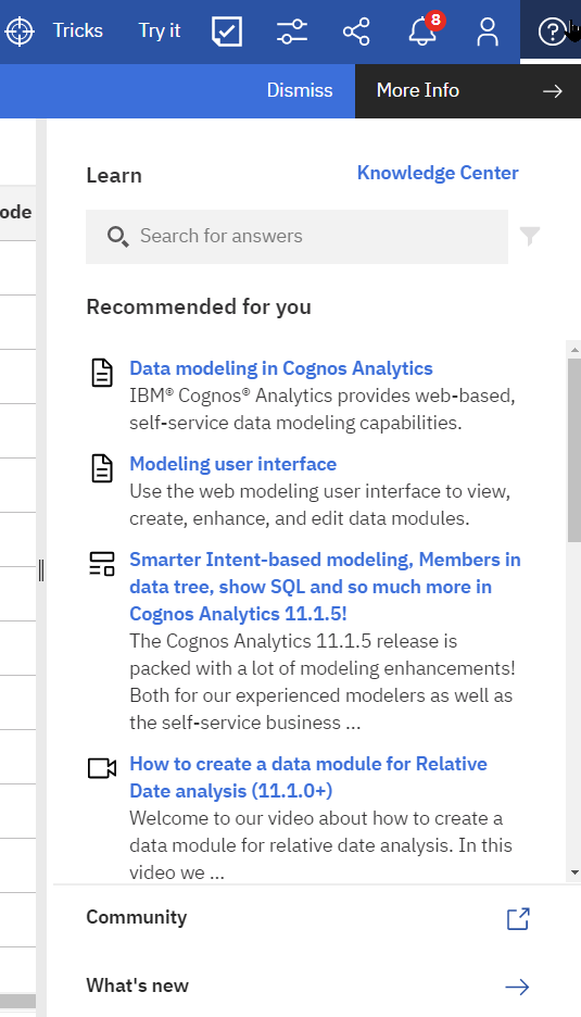
Ask for help in the cognitive Learn pane
Just click and ask a question. The cognitive help tailors your question to where you are working and finds only the answers that are relevant to you.
Changes to Dashboards
New Dashboard UI
Dashboards received a most welcome UI refresh. It is much easier to understand visualization composition and formatting options thanks to changes to context menus and a new ‘fields’ section.
Visualization toolbar is docked at the top of a dashboard
The toolbar for visualizations is now at the top of your dashboard and is docked there by default.
The toolbar icons that are displayed depend on what you select on the dashboard. For example, if you click a table visualization on the dashboard, the toolbar appears with the icons that you can use for tables.
You can undock the toolbar so that it is attached to a selected visualization.
Access to options like linking visualizations, filters and properties has been grouped and simplified. The new ‘Fields’ button brings up a new fields view, which shows the fields of the selected visualization. If you select a new visualization this section will change to reflect your new selection.
This impactful redesign makes navigating dashboards so much easier compared to previous releases because you can always tell what visualization is selected and easily and quickly access all visualization elements. You no longer have to rely on hidden menus and focus mode, which has received a redesign.
Revamped focus mode
Focus mode has been repurposed and now functions basically as a ‘full screen’ button for an individual visualization. All the old focus mode features now reside in the new ‘Fields’ view. Focus mode is now also available to dashboard viewers, not just in edit mode.
Crosstab Changes
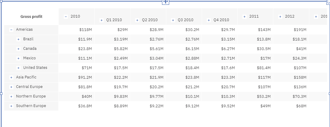
Crosstabs now support expand/collapse on cubes, including Planning Analytics, Power Cubes, and Microsoft Cubes, which is helpful when navigating dimensional data.
Expand and collapse currently function only for OLAP sources – not for navigation paths made in data modules. IBM will be fixing this in an upcoming release.
Customize unit labels
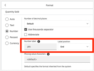
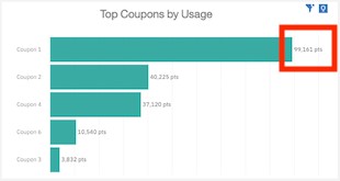
You can define a custom label on a measure.
For example, if you have a bar chart that shows numbers, you can specify a label for the numbers, such as pts to indicate that the numbers represent points. You can also specify the position of the label, such as End.
View source in dashboards
It is now possible to identify the exact field used in a visualization. A new popup appears whenever you hover over a data item in the fields view. In previous versions it was impossible to tell which table supplied a field in a visualization, leading to much confusion when there were multiple fields with the same name in a model.
Guided dashboard creation
From the embedded assistant, you can now generate a dashboard based on specified fields of interest.
This capability was introduced in version 11.1.4 as a two-step process. After generating a set of charts for selected fields/columns, a Create dashboard from the charts option was provided. Beginning in 11.1.6, you can guide the dashboard creation by including context and field information. For example:
- create dashboard for profit in 2019
- generate dashboard for top 10 products by profit
- create dashboard for products by profit in Florida
Use AI to personalize recommended visualizations
IBM Cognos Analytics recommends particular visualization types based on your selected data. With AI learning, your usage and preferences are used in subsequent recommendations to provide a more personalized experience.
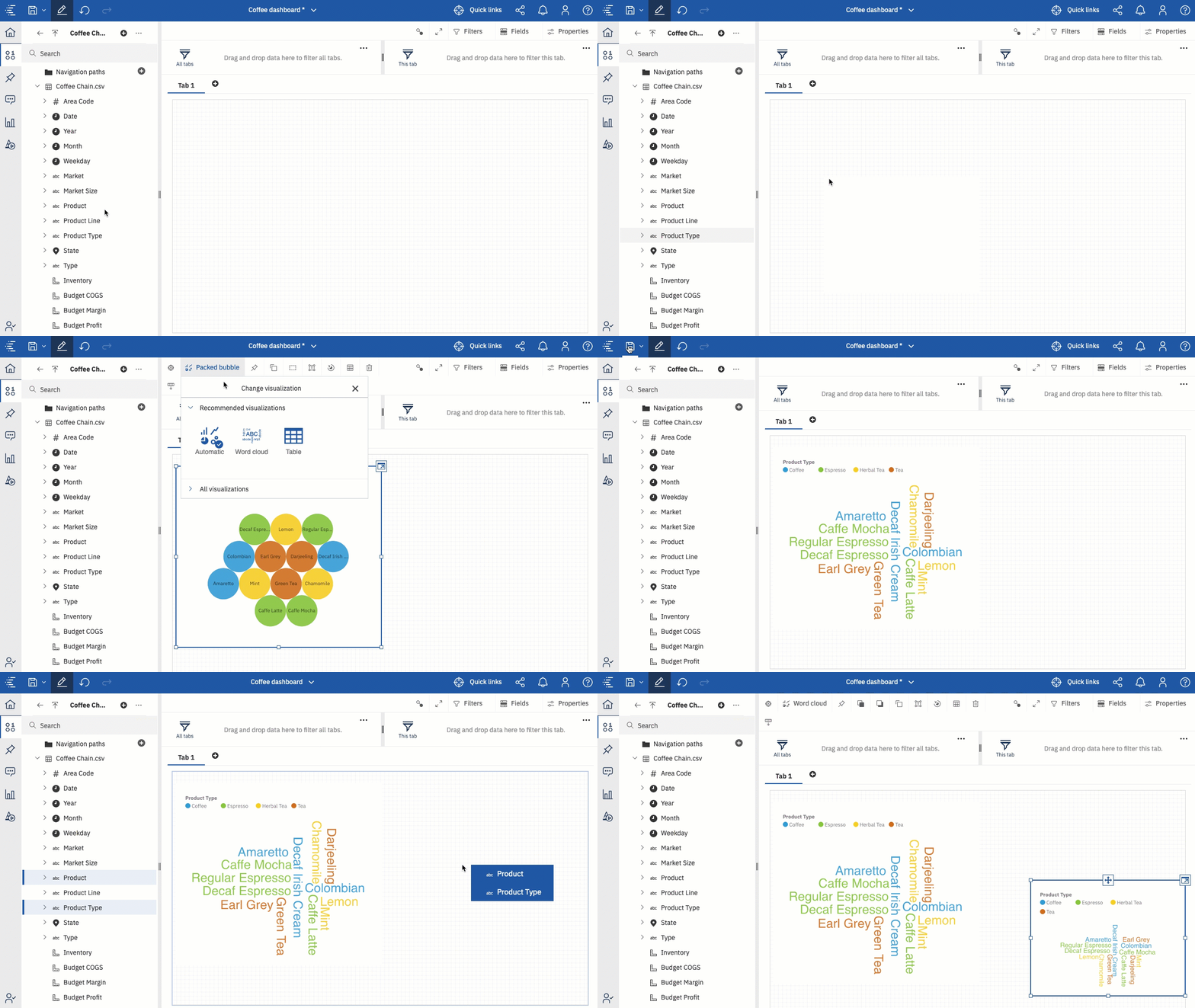
For example, Cognos Analytics may recommend a Packed bubble chart. By changing the recommended visualization to Word cloud, and saving your selection, AI learns from your usage and may choose the Word cloud chart next time. Right now this works on an individual level rather than system wide.
Stand alone calculations in advanced analytics
The AI assistant and explore capabilities in previous versions could not factor in standalone calculations. Framework Manager often requires a standalone calculation to aggregate correctly. The only way around this was to build a data set – still strongly recommended to do for many reasons, however as of 11.1.6 the AI Assistant and the Explore features now consider these important calculations when “doing their thing”.
Check out more on what’s new in IBM Cognos Dashboards 11.1.6
Changes to Reporting
Data Table in Reporting
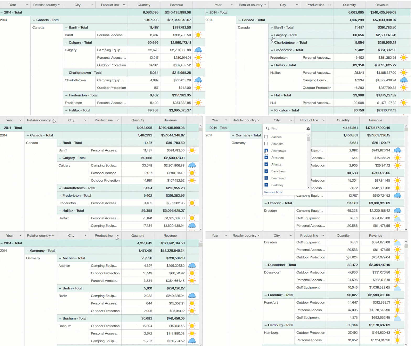
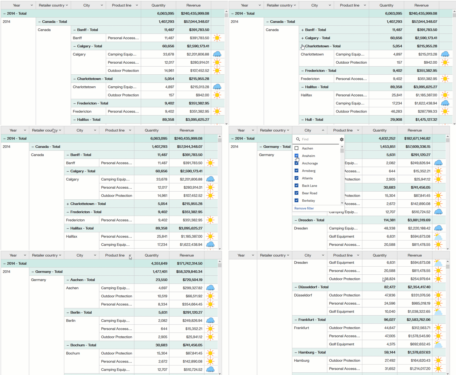
You will now find the Data table available when you go to the Data Container section when building a report. The Data Table is a highlighted new feature of this new release and is like a list table but has more interactive functionality, for example you can collapse/expand dimensions and add calculations.
Capabilities of data tables include:
- Expand/collapse for OLAP data sources;
- Each column features interactive filter and search capability;
- Color/size/image indicators for KPIs;
- Scroll bar exists in the data table rather than for the page.
Reporting Visualization Enhancements
The reporting enhancements made in 11.1.6 bring the authoring experience more in line with the interactivity available in dashboards.
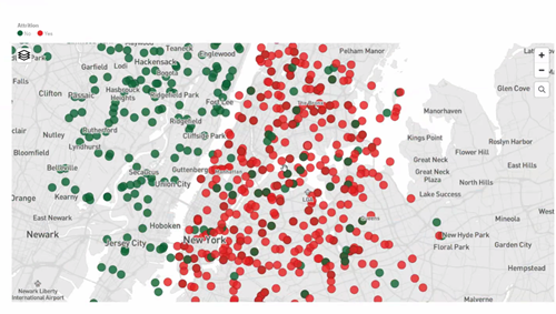
Point Colours on Latitude/Longitude in Maps
You can now put point colours on latitude and longitude on a map so highlight data, the below example shows attrition.
Drill in 11.1.x Visualisations (was already available in dashboards)
This feature was bought back to 11.1.x visualisations and you can now drill up and down on a visualisation.
Multiple Measures (was already available in dashboards)
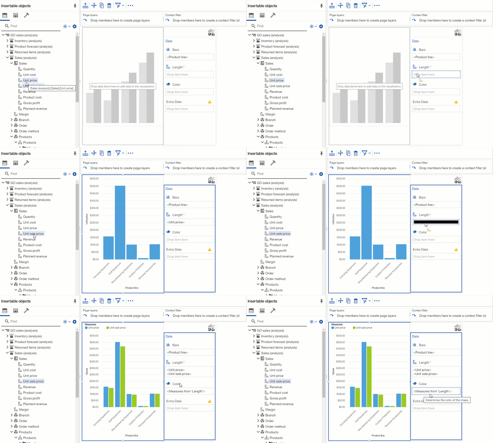
For column and bar visualisations the ‘measure group’ function has now been activated. This means you can now drop multiple measures within a visualisation to display them within a single chart.
Data Module Changes
Data modules didn’t receive new features in this release, but three major quality of life enhancements for authors were introduced related to interaction with data servers, improving product usability. It is now significantly easier to load metadata, identify new fields and add only those that you need to your model.
Add individual fields to data modules
Previously, you could only add tables to data modules, not individual fields. As a result, you sometimes had to re-add hundreds of fields then manually delete them just to get a single new field into your module. You can now add individual fields directly to the tables within a data module.
See unused fields in data sources
The ‘show unused items’ feature makes it easy to identify which fields in your data source are not currently in your data module.
Reload metadata schema from data modules
Authors now can reload metadata directly from the data modules UI.
Check out the full list of new and changed capabilities of this release here.
Reach out to us today to upgrade to the latest and greatest version of Cognos Analytics.

