In our last blog, we explained what dashboards are and the purpose of a dashboard for visualization. As a continuation on the topic of dashboards, here is an outline of how easy it is for business users, even those who are new to analytics software and have had no prior training.
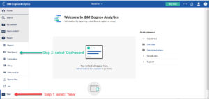
To build a dashboard in IBM Cognos Analytics, you start off by going into the Cognos portal. At the bottom left of your screen, you will see a ‘New’ button which gives you quick access to build a report or dashboard and create a data module. You then just click the ‘New’ icon then select ‘Dashboard’ and you will see a choice of dashboard templates available.
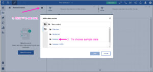
You can click on the template that you like from the templates shown, then click ‘ok’ and name your dashboard to get started. To add data, click the ‘+’ icon in the top left of your screen. This allows you to navigate to your content to access previously uploaded data files. Or you can select sample data if you are just experimenting. Click ‘Add’ after selecting the data file that you want to work with.
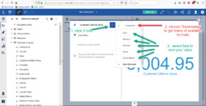
On the left-hand side of the screen you can start choosing what measures and attributes you want to put into your dashboard. You then simply drag and drop each measure you want to include onto the canvas. For example, if you click on ‘Customer Lifetime Value’ and drag it on to the dashboard, Cognos will create a sum of the measure automatically.
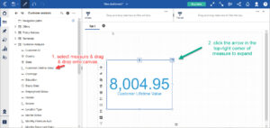
By right-clicking on the arrow in the top-right corner of each of your measures, you can format the measure how you would like to see it. In our above-stated example, you could change how you view Customer Lifetime Value from a sum to a minimum, maximum, count or count-distinct.
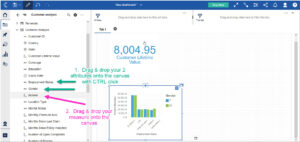
You can also re-size and move your measures around in your dashboard easily by just grabbing them with your curser, as well as add titles to your measures so that your dashboard is easy to read and understand.
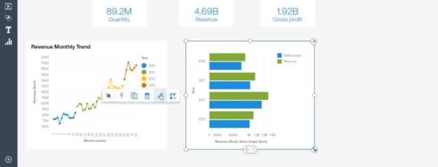
You can choose 2 attributes that you want to break down by a particular measure and analyze this data graphically by simply selecting both attributes using CTRL-click and dragging them to the same area in dashboard. You can then drag in your measure from the left-hand side of the screen onto the area where you dropped your attributes. Cognos will choose a visualization to display this data.
You can change the display format to whatever you like by clicking on the arrow in the top right corner of your visualization. You can create as many visualizations as you want in the same dashboard.
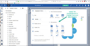
You can take your analysis further by clicking on any element in your visualization and you will see the numbers in your chosen measures change accordingly to reflect the analysis of your chosen element. You can collapse the chart whenever you like and/or resize it to fit into your dashboard.
IBM Cognos Analytics leveled the playing field in terms of dashboarding creation and functionality with the release of Cognos 11.0 in December 2016. The 11.0.10 release of IBM Cognos Analytics introduced support for the most popular request for enhancement (RFE) across all of IBM – the ability to drill-through from a dashboard to report. With the added drill capabilities, it is now easier than ever to author a drill-through that passes the content of a dashboard visualisation to an authored report.
Click on the button below to watch some short step-by-step demos for beginners on how to create your first dashboard in Cognos 11.1.0+.


Recent Comments